The tempera on panel painting, “Saint John in the Desert”, was created by Italian artist Domenico Veneziano in 1445 and the oil on panel painting, “Saint John the Evangelist on Patmos” was created in 1547 by Italian artist Titian Venetian. Both artists use various themes to detail the events of their work.
The theme utilized in Veneziano’s work is story and history. Stories and histories are often used by artists as they provide a subject matter for their creations (Getlein 62). Subject matter refers to the objects or events a work of art illustrates and in his painting the Biblical historical stories or events are depicted (36). Placement and color play significant roles in Veneziano’s work as these principles and elements are used as emphasis in the scene and thus display importance. The theme of human experience can be observed here as well as Veneziano’s saint lowers his robe in a gesture of relinquishing worldly possessions and concerns. His nudeness suggests rebirth; the start of new life of spiritual existence while the ruggedness of the mountains depict the honest and stark challenge he has accepted.
Color is used for a similar purpose in Titian’s painting. However, the notable difference here is the additional ingenuous use of light and line which further emphasizes the important action occurring in the scene than the artist’s use of monochromatic harmonies in the saint’s robe would achieve alone. In addition the theme of human experience is used and the stance that Titian’s saint displays indicates the immensity of the revelation he is about to receive.
To display the subject matter in their work, Veneziano and Titian both use various themes.
Wednesday, February 27, 2008
Monday, February 18, 2008
Activity #4: Write About It!
Saint John in the Desert, tempera on panel work, was created by Italian artist Domenico Veneziano in 1445. In 1547, another Italian artist Titian Venetian, created Saint John the Evangelist on Patmos with oil on panel. To engage viewers’ attention to the critical components of their work, both artists employed four common principles of design: unity and variety, emphasis and subordination, balance and rhythm (Getlein, 121).
The principle of unity in art refers to as a sense of oneness or visual harmony while variety is everything else; the difference disturbing that unity by creating interest (122). In Veneziano’s painting, unity is observed by the general theme of the painting and the subtle but continuous shifts in value. The nakedness of the saint blends with the openness (or nakedness) of the mountains and the use of naturally earthy tones are also consistent with the saint’s flesh. Variety is displayed into this natural milieu by the use of the primary color red. Here, this warm color is the most distinct of all, claiming the viewer’s attention. Titian too employs color to signify variety in his work but unlike Veneziano, he uses hints and values of red as well as light and action to signify interest. This notation is can also be explained using the design principle of emphasis and subordination. These concepts coexist and thrive by the effect of each other. Emphasis is the focal point, or a clearly defined area to which one’s eye is attracted and in Veneziano’s work, is John’s red cloak (134). Subordination refers to other areas purposely made less visually interesting so the emphasis remains vibrant and overt (134). This is evidenced in Titian’s art by the dark contrast of the mound John stands on as well as the cool submissive blue of the sky.
Visually speaking, balance refers to the equal distribution of weight along its central axis (124) and can be defined as symmetrical or asymmetrical (125,129). Symmetrical balance is described as evenness in shape, size, and placement on both sides of an imaginary vertical line in the center of a painting while asymmetrical balance confers the opposite, unevenness (129). The placement of angels and holy characters in the upper left of Titian’s painting signify asymmetry. In addition, the bulk of John’s bright red outer garb, his physical position in the painting and the gaze of the eagle are directed leftward. Veneziano’s work is also descriptive of asymmetrical balance and this is shown by the tendency of the mountains and the bushes to lean to the left of painting; thus creating an unequivocal fullness or weight on that side.
Lastly, rhythm is expressed throughout both works. Rhythm is based on repetition and is often used to direct the view to different places within an artwork (141). Titian painting exudes a soft circular rhythm and is expressed by the roundness and softness of the clouds, the skies, and John’s billowing robes. Conversely, the sharp and jagged slopes of Veneziano’s mountains are repeated throughout the painting, guiding our eyes on an l-shaped path left to right and then to the rugged terrain below. As displayed in their work, Veneziano and Titian effectively utilized the principles of design.
Wednesday, February 13, 2008
Activity #2 REWRITE: Write About It
REWRITE
In 1445, Italian painter Domenico Veneziano created Saint John in the Desert. This tempura on panel painting shares some similarities as well as differences in visual elements with Titian Venetian’s Saint John the Evangelist on Patmos which was created using oil on canvas. Visual elements are line, shape, mass, light, value, color, texture and space and are used to create art (Getlein, 81). Both artists employ color, line, light, and space as visual elements in their work.
Veneziano and Titian use forms of perspective to convey space. Linear perspective is applied when forms appear to diminish in size as they recede or when parallel lines appear to converge in the distance until they disappear (109). In Veneziano’s use of linear perspective one can see a path to the right leading to the horizon and naturally disappearing. A vanishing point is created and the art’s model appears to be larger than some of the mountains in the scene. Titian however, more employs atmospheric perspective—the observation in which distant objects appear paler, bluer, and less distinct than nearby objects due to the scattering of light by moisture and dust in the atmosphere (113). The main character in Titian’s painting is clothed in the vibrant color of red while the extra figures in the background appear more bluish. Veneziano uses the primary color red to command attention to the painting’s only character. Primary colors---red, yellow, and blue---are labeled as such because they cannot be made by mixing any other colors (95). Similarly, Titian uses values of red to clothe his main character who also demands attention due his to the use of light and line.
Implied light, artificial and permanent, is used to model mass and shape and is created by artists using light and shadow (92). The vibrant red of the lowered cloak and the golden halo of John’s head are examples of the Veneziano’s use of implied light. However, he is not as effective in depicting mass and shape using implied light as Titian. Titian uses chiaroscuro, the technique of using value (shades of light and dark) to record light and shadow (92). The mass and shape of his John’s thigh under his robe is made visible using this technique and his John appears more realistic and three-dimensional. Continuing, Titian’s use of implied line, dotted lines we mentally create, can be seen if one visualizes an imaginary diagonal line that begins with the eagle and rises through to Saint John’s outstretched hands and the distant characters (86). Veneziano also uses diagonal lines in the mountains’ jagged peaks to promote direction and engage our attention to Saint John at the center of the painting. The combined use of these elements assist in creating a visual experience.
ORIGINAL
Similarities are present between Titian Venetian’s Saint John the Evangelist on Patmos (c. 1547) and Domenico Veneziano’s Saint John in the Desert (c. 1445) with the most obvious relating to content; the use of the Biblical characters John as the artwork’s theme. (It is important to note the Johns in both works are different Biblical characters). The two artworks employ the use of line- a path traced by a moving point, to convey direction and motion (Getlein, 82) and exemplar descriptions are Veneziano’s desert path heading backward into an spacious unknown length of land and Titian’s John’s upward gaze and hands, urging the viewer to look up as well. Light is present in the works as well and combined with the various hues, values and colors (red is used by both artists), engages the visual senses of the reader as well as directs attention to the important themes in the work.
Apparent differences between these two works include the use of texture and naturalistic approach. Naturalistic refers to the approach by artists to create work that portrays the visible world and closely resembles the form it depicts (Getlein, 29). This can be seen by how the bodies in Titian’s work accurately reflect human bone and muscle and how the garments worn freely flow and fit their wearers. Contrastly, Veneziano’s mountainous background appears archaic and somewhat unnatural. Along with shifts in value, shades of light and dark (Getlein, 92), Veneziano uses contrasts of shape and texture, or our perception of the feel of an object (Getlein, 103), to express the ruggedness of the wilderness’s mountainous terrain and the softness of the garment the saint lowers.
Tuesday, February 12, 2008
Activity #1: Online Museum Visit
Below are the pieces of art I have chosen from my Online Museum Visit.
"Saint John in the Desert" by Domenico Veneziano

"Saint John the Evangelist on Patmos" by Titian

"Saint John in the Desert" by Domenico Veneziano

"Saint John the Evangelist on Patmos" by Titian

Creative Blog
~~~~~~~~~~~~~~~~~~~~~~~~~~~~~~~~~~~~~~~~~~~~~~~~~~~~~~~~~~~~~~~~~~
The next two pictures are representative of the phenomenon that "keeps the world in orbit".

~~~~~~~~~~~~~~~~~~~~~~~~~~~~~~~~~~~~~~~~~~~~~~~~~~~~~~~~~~~~~~~~~~

~~~~~~~~~~~~~~~~~~~~~~~~~~~~~~~~~~~~~~~~~~~~~~~~~~~~~~~~~~~~~~~~~~

There is nothing like a night out with friends and hot pairs of shoes! This picture is personally inspiring.
~~~~~~~~~~~~~~~~~~~~~~~~~~~~~~~~~~~~~~~~~~~~~~~~~~~~~~~~~~~~~~~~~~

About this picture...I'd say someone got carried away with primary colors and makeup. Hot artistic mess!
~~~~~~~~~~~~~~~~~~~~~~~~~~~~~~~~~~~~~~~~~~~~~~~~~~~~~~~~~~~~~~~~~~

While this may appear cool to some...it's kinda creepy in my opinion. Reminds me of something from a sci-fi horror movie that will eventually try to end the human race.
~~~~~~~~~~~~~~~~~~~~~~~~~~~~~~~~~~~~~~~~~~~~~~~~~~~~~~~~~~~~~~~~~~

This is a bed I'd rather NOT sleep on! Imagine turning a centimeter of an inch and it would be "body, meet floor!"
~~~~~~~~~~~~~~~~~~~~~~~~~~~~~~~~~~~~~~~~~~~~~~~~~~~~~~~~~~~~~~~~~~

At first glance this pic seemed mystical but it appears it might actually be real... or it still could be mystical. lol The skies are suggestive of a brewing storm yet the gracefully-gowned ladies appear oblivious to the signs as they are captured in their pose.
~~~~~~~~~~~~~~~~~~~~~~~~~~~~~~~~~~~~~~~~~~~~~~~~~~~~~~~~~~~~~~~~~~~

Talk about the creative use of colors...so her hair branches off into tree roots which are filled with warm and bright colors...very interesting and cool.
~~~~~~~~~~~~~~~~~~~~~~~~~~~~~~~~~~~~~~~~~~~~~~~~~~~~~~~~~~~~~~~~~~~

The above is another image (grafitti) created by British street artist Robert Banks aka Bansky. The work is self-explanatory; a young presumably innocent litte girl is being frisked/searched by a policeman. This image may have initially been created to imply the ridiculousness and absurdity of the act. However, in today's society even this act can quickly become a reality as terrorists now take the face of everyone; young, old, male, female and yes, even pretty little girls in pink.
~~~~~~~~~~~~~~~~~~~~~~~~~~~~~~~~~~~~~~~~~~~~~~~~~~~~~~~~~~~~~~~~~~~

Robert Banks or Banksy is known for his creation controversial, political and graphic works, mostly graffiti. The above was created to express the sentiments of those who disproved of evolutionist Charles Darwin and his theory of human evolution and natural selection. I personally find Banksy's representation comical and entertaining.
~~~~~~~~~~~~~~~~~~~~~~~~~~~~~~~~~~~~~~~~~~~~~~~~~~~~~~~~~~~~~~~~~~~

So...have you any idea what the circled miniscule dot in the above picture is? On February 14, 1990 the Voyager 1 spacecraft had completed its primary mission of visiting Jupiter and Saturn and now on the fringes of the solar system was commanded by NASA to turn around and take one last picture of its home planet. The above picture is representative of what was seen 4 billion miles away. That miniscule, trivial and insignifiant dot known as the Pale Blue Dot is our lovely planet, Earth. In all our power and glory, our past and present civilizations, with our suffering and victories; all that have ever lived and all we have ever known and loved has been confined to the smallest palest and bluest dot, Earth.
~~~~~~~~~~~~~~~~~~~~~~~~~~~~~~~~~~~~~~~~~~~~~~~~~~~~~~~~~~~~~~~~~~~
 Martin Johnson Heade
Cattleya Orchid and Three Brazilian Hummingbirds, 1871
oil on wood, 34.8 x 45.6 cm
Heade enjoyed depicting still lifes and landscapes. This painting is perhaps...a combination of both.(?) Packed with numerous visual elements and principles of design, the painting (to me) displays the peace and beauty of nature, at its best.
~~~~~~~~~~~~~~~~~~~~~~~~~~~~~~~~~~~~~~~~~~~~~~~~~~~~~~~~~~~~~~~~~~~
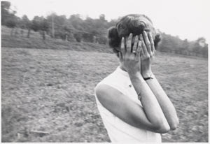
Can you say camera shy? This photograph hails from Robert E. Jackson's Collection The Art of the American Snaphot which once chronicled the evolution of snapshot photography from the invention of the Kodak Camera through the 1970s. Despite the shy illusion portrayed by covering her face, I strongly believe this "model" performance was intentional.
~~~~~~~~~~~~~~~~~~~~~~~~~~~~~~~~~~~~~~~~~~~~~~~~~~~~~~~~~~~~~~~~~~~
 The above is a picture of a supergiant star on an upcoming exhibition at the American Museum of Natural History. My thoughts? Absolutely stunning and beauty.
~~~~~~~~~~~~~~~~~~~~~~~~~~~~~~~~~~~~~~~~~~~~~~~~~~~~~~~~~~~~~~~~~~~

"Day and Night", c.1938
woodcut in black and gray
M.C. Escher created this visually deceptive masterpiece using shifts in values of black, white and gray. I think this work is appropriately entitled Day and Night as one side of the work depicts each theme. Escher's fascination with metamorphosis can be seen as the landscape below changes and morphs into doves. Visually speaking, the work is actually symmetrical as well. I find this work simply interesting.
~~~~~~~~~~~~~~~~~~~~~~~~~~~~~~~~~~~~~~~~~~~~~~~~~~~~~~~~~~~~~~~~~~~~~
The two main balances described in Chapter 5 of Getlein's Living with Art are symmetrical and asymmetrical balance. The two balances contradict each other: symmetrical is descriptive of a design in which the t wo halves of a composition on either side of an imaginary central vertical line correspond in shape, size and placement while asymmetrical refers is the opposite. Below are examples of symmetrical and asymmetrical balances, respectively.
Peter Behrens. (German) Fan c. 1908. Painted cast iron and brass
Preston Dickinson. (American) Harlem River, c. 1928. Oil on canvas
This first artwork is expressive of symmetrical balance. The size, shape and placement of the fan's blades appear to equal on both sides of the vertical axis; equally distributing the weight. The second, Dickinson's painting, displays asymmetrical balance. Visually speaking, most of the buildings, objects and the activities within the painting are exude from the left, creating an unbalanced scene with the emphasis there.


~~~~~~~~~~~~~~~~~~~~~~~~~~~~~~~~~~~~~~~~~~~~~~~~~~~~~

With the intention of completing an assigment, I went to nga.gov and there on the home page was Johannes Vermeer's "Girl with the Red Hat" made with oil on panel c. 1665. What striked me about the painting is the the revelation of the model being.. a girl. My initial glance depicted masculinity. In addition, this picture contains several artistic visual elements and implements the use of various colors, values, hues and texture. For simple reasons as such and mainly due to its beauty, I chose this painting.
Sunday, February 10, 2008
Introductory Post
Hey everyone. I'm testing out blogspot and inserting htmls and all that other good internetty stuff...If anyone has a Myspace they will see that this is essentially the same. If you care to share, let me know your thoughts!


Subscribe to:
Comments (Atom)